Visualize Your Data Story
Unlock the power of data storytelling in the biomedical realm. Learn practical techniques to captivate audiences and drive informed decisions.
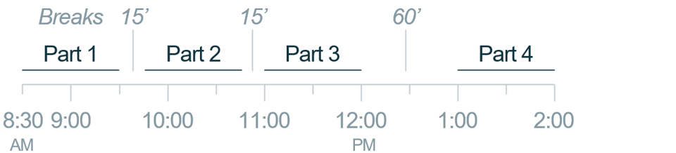
In Person: Four hours in four parts, plus 90 minutes in breaks.
Live Online: Four 1-hour sessions per day over one to two weeks
For Your Team
Interested in training a team of six or more people? We’ll work with you to understand their needs, optimize group sizes (for large teams) and coordinate schedules.
$5,100 for up to six people
For Individuals
Beginning in June 2024, we will offer individual seats in publicly scheduled courses. Let us know you’re interested so we can reach out to you when we launch this program.
$850 per person

- Overview
- Approach
Dive into the art and science of data visualization with your own dataset at the helm. This dynamic, interactive workshop will equip you with the skills to enhance audience understanding and influence decision-making, resulting in practical outcomes.
We use drug-discovery examples to help you navigate the ocean of data-communication choices that software offers. During the workshop you’ll apply these lessons to your own data step-by-step, so that you accomplish important work while you learn.
Avoid Common Pitfalls. Our minds turn first to your audience—how they process visual quantities, and how your choices can clarify or obscure your data’s message. This segment concentrates on making it easier for your audience to decode quantitative information, while eliminating interfering noise.
Pinpoint the Essence. Here we focus on the crucial process of distilling complex data into its most meaningful elements. This section introduces the first three steps of our 5-step methodology, demonstrating their application through a real oncology case study from Tyra Biosciences.
Visualize Effectively. The last two steps of our 5-step method concentrate on selecting data-visualization formats that serve your audience. For example, when to choose a table or a graph—and what type of graph—designed so that the meaning of your data sings. As a bonus, you’ll see video of Tyra’s CEO presenting our case study example.
By the conclusion of this workshop, you’ll have gained valuable insights into transforming complex biomedical data into straightforward, actionable information. This workshop is your gateway to becoming a more effective data storyteller. Join us to unlock the full potential of your data, leaving a lasting impression on your audience.
Part 1
60 minutes
Avoid Common Pitfalls
- Encode quantities so audiences accurately decode them
- Avoid potentially damaging encoding errors
- Amplify your data signal and minimize noise
Pinpoint the Essence—Illustration
See the five-step method rapidly applied to communicating results from cell-based assays in a preclinical oncology setting.
Part 2
60 minutes
Pinpoint the Essence—Application
Apply the first three steps to your own data in parallel with the Tyra Biosciences case study, which focuses on drug lead optimization:
- Identify your data’s core message
- Simplify that message to its essential elements
- Storyboard your communication for clarity and impact
Part 3
2 x 60 minutes
Visualize Effectively
Apply the last two steps, in parallel with the case study:
- Select appropriate data visuals, e.g., table vs. graph
- Design tables and graphs so they highlight your message
- Build clear slides that inform and guide decisions
Live Online
Four 1-hour sessions per day over one to two weeks
In Person
example
More Training

Five Steps to Clear Slides
Join us on this before-and-after journey to experience the transformation of a key slide from an oncology pitch-deck into a clear, compelling scene that powerfully engaged prospective investors.
In-Person or Virtual: 2.5 hours
Brain-Friendly Bridges
By understanding foundational concepts like attention allocation, the mechanisms of memory, and the balance of mental and emotional bandwidth, this workshop guides participants to craft presentations that captivate, inform, and leave a lasting impression.
In-Person or Virtual: 1.5 hours

Persuasion Strategy
In this hands-on workshop, you’ll learn how to build a well-structured, persuasive story tailored to motivate your target audience to act. Throughout the workshop, you’ll apply Cruxio’s seven-step process to a strategic story of your own. These outputs will give you a jump-start on developing an upcoming persuasive communication that matters to you and to the success of your business.
In-Person: two 4-hour sessions (recommended)
Virtual: four 2-hour sessions

The Cruxio Bridge in Action
Experience it through this 1.5-hour workshop based on an interactive ‘Make or Buy?’ case study, which introduces the transformative methods summarized in ‘The Cruxio Bridge Guide.’
In-Person or Virtual: 1.5 hours